Reviews & Articles
Konstantin Bessmertny: Ad Lib
John BATTEN
at 6:26pm on 20th December 2016


Captions:
1. Art Pyramid, drawing (2013), reproduced from Ad Lib magazine/Konstantin Bessmertny: Macau Museum of Art exhibition catalogue, 2016
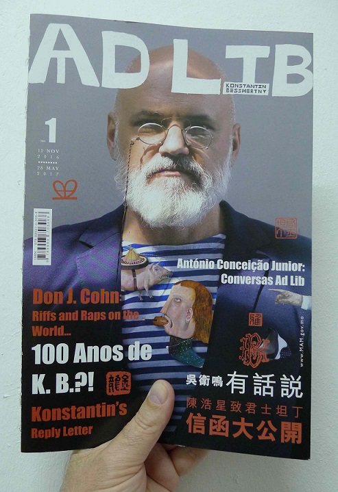
2. Cover of Konstantin Bessmertny: Macau Museum of Art exhibition catalogue, 2016
(原文以英文發表,評論〈Ad Lib──君士坦丁近作展〉。)
It was a pleasure to see Konstantin Bessmertny’s recent work at the Macau Museum of Art (MAM). Presented is a vibrant cornucopia of paintings, sculpture, small dioramas and lots of quirky motifs, squiggles and commentary that screams energy, life and a sardonic view of the world. And, the exhibition catalogue is itself a work of art. Printed in a run – sorry, let’s stick with art world language: it is ‘in an edition’ of 800. Grab one, free it from its special plastic cover, look and then carefully archive the included adhesive stickers (bonus, they might also become collectable). Then, venture into the playroom that is this ‘catalogue’.
It has the all essentials of a publication accompanying a prestigious exhibition: images and annotated artwork; biography; introductions by officials (including, top of the tree and a worthy honour for the artist, former MAM-Director now head of Macau’s cultural ministry, Ung Vai Meng); artist interview; ‘critical’ essay; fabulous design. All that aside! It has something unusual, something rare, even rarer: humour! Yes, you will smile. Perhaps, a shock for the art world, even giggle!
The cover of Bessmertny’s catalogue looks like a glossy art magazine. No - it IS an art magazine. Of course, the confident Bessmertny fronts the mag-cover sporting a snazzy pince-nez and, in tune with some of his painted characters, a striped-T, surrounded by the sort of promotional text that any ‘good’ glossy art magazine must have on its cover. But, the real treats are in between the covers!
Inside is a long joke at the expense of the art world. Running through the magazine and smudged in a corner of a painting, or in an intimate section of a sculpture is a graphic or drawing appearing in different abbreviated forms. The magazine version is an “Art pyramid in TIMES of CORPORATE CAPITALISM” published by the “Artists Liberation Front” and presented as a 19th century taxonomy of the art world. This drawing is of a heaped stack of pigs, with the ‘artist’ at bottom, followed by and pressing down, in order: the ‘art gallery’, ‘art curator’, ‘art biennial’, ‘art critic’ (me!), ‘art collector’ (possibly you!), ‘art fair’, ‘art museum’ (the artist’s magazine sponsor), ‘art foundation’, ‘corporate art collection’, ‘art auction’, and ‘art trend’.
But, is the magazine spoof just an art critic’s interpretation? Is the museum visitor also privy to this joke on the art world? Well, trust me – I leave it to the artist to confirm what I say. In conversation, Antonio Conceição Junior asks the artist: “The catalogue of this exhibition is not what one would expect. It has a magazine format. Is it another provocation or, again, is it a new form of libidum (freedom). Konstantin Bessmertny confirms that, “We live in transition times when we can’t apply old formulas. The form of the catalogue is just an experiment. It is a parody on gloss, glamour and pop, but also, it has what a conventional scholarly catalogue would have.”
See, I was right. Confirm it yourself! Read Ad Lib, the magazine, after visiting ‘Ad Lib’, the exhibition.
Link for further info:
'AD LIB- Recent Works by Konstantin Bessmertny' @ Macau Museum of Art
Originally published in Artomity magazine, December 2016
|
|
|
|
|
|
