Art Issues
- West Kowloon Cultural District / M+The latest article on a special issue topic is below. Other articles on the same topic can be read by clicking on the 'Archive' year and month on the side-bar.
Building M+
John BATTEN
at 0:00am on 17th February 2014


Captions:
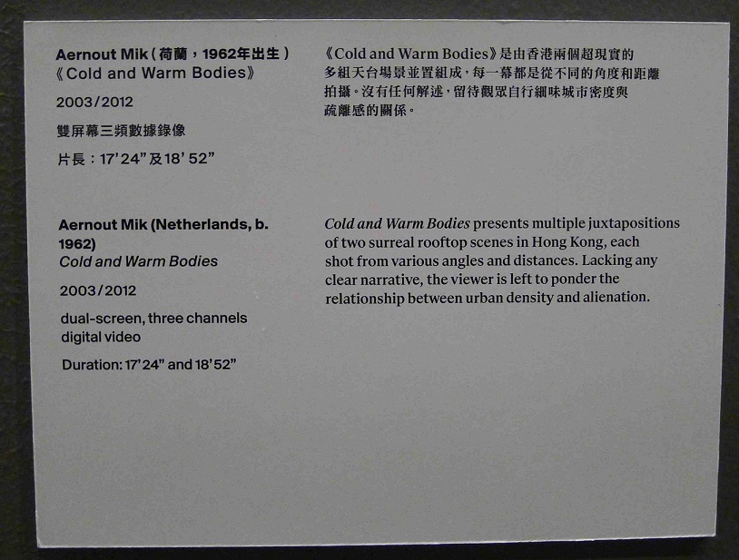
1.&2. Aernout Mik (Netherlands), 'Cold and Warm Bodies', dual-screen, three channel digital video, 2003/2012, video still (see next image for full description). (Image with 3 panels and another image of foamboard)
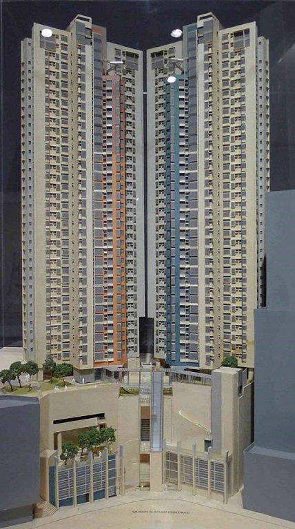
3. Rocco Yim Design: Model of Hollywood Terrace - located on Hollywood Road and (as seen from this view) Queen's Road Central. During construction the site experienced great engineering challenges due to being located in the Mid-levels exclusion zone of unstable topography.
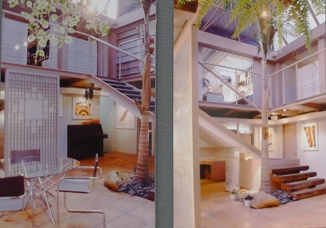
4. Interior view of Tao Ho container office, then located at the present minibus station above Kowloon Tong MTR Station.
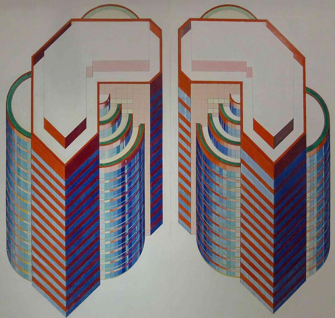
5. Palmer and Turner (P&T Group)/Remo Riva, Sketch for Exchange Square I,II & III, Hong Kong. Ink, pencil & colour pencil on paper, 1983.
(原文以英文發表,評論「構。建M+:博物館設計方案及建築藏品」展。)
In the early 1990s, architect Tao Ho, best known for his innovative design of the Hong Kong Arts Centre, had an office for his architecture practice in Kowloon Tong using 24 inter-connected shipping containers. This contravened building codes, lease and land use conditions of the site. The modular form of the office, however, replicated the vernacular buildings occupying Hong Kong’s last major squatter area in nearby Diamond Hill.
Letters shown in this exhibition between the Buildings Department and Tao Ho about the removal of his “illegal” office echo similar correspondence that a generation of Hong Kong residents experienced after improving their own tight living conditions by maximizing space by constructing illegal balconies, rooftop structures and expanding onto public space.
It is the sociological exploration and associated stories about Hong Kong’s built and urban forms that make the future archives, models, drawings and photographs of the new architecture collection of M+ so exciting. This inaugural exhibition and education area for students of all ages is an excellent introduction.
Assembling a holistic story for architectural objects needs a forensic curatorial eye. Ian Lambot’s static aerial photograph of the infamous Kowloon Walled City becomes animated when shown alongside a “video map” by researcher Suenn Ho, filmed as she wanders through a labyrinth of shadowy lanes chatting to shop owners, residents and policemen. Alternatively, the seemingly innocuous model of the Rocco Yim designed Hollywood Terrace is displayed, but the story of its development, long delayed by a serious landslip and difficult engineering, is untold.
The audience can deduce an architect’s intention: the dull corporate towers of Exchange Square look nothing like the original colourful renditions by architect Remo Riva (see image). His original drawings also show Elisabeth Frink’s water buffalo sculptures as integral in his courtyard design – their return in situ is expected after the current Exchange Square Three redevelopment is completed.
The models and design rationale of each of the shortlisted contenders to design the M+ building are for the first time publicly displayed. The chosen Herzog & de Meuron design is the best. The other contenders submitted overly, and under the circumstances, oddly ornate designs. It is easier to ask in retrospect, but was the short list of contenders the best?
Exhibition:
Building M+: The Museum and Architecture Collection @ ArtisTree
A version of this review was published in the South China Morning Post, 21 January 2014.
